Collaborate idea cards
20 Dec 2021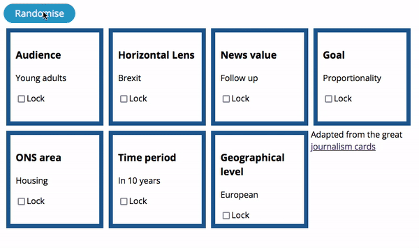
I’ve previously written about the digital content team but a lot has changed since them. The data visualisation team is now 17 people strong and we have 9 data journalists, about to be 10. We’ve split up our work into teams based around four functions rather than discipline with the intension of allowing people to focus on particular aspects of work. The four functions are:
- Publish
- Improve
- Collaborate
- Innovate
I am co-leading the collaborate function and this takes over the old digital content team. Our purpose is to produce content specifically focussed on the citizen audience.
One task we often do is think about ideas for analysis. Often this can start from an interesting annecdote and a conversation follows about what the ONS can say about it with statistics, or it can be a topic which we feel is newsworthy, relevant and timely. Sometimes these topic can come from the organisation itself, as it’s trying to bring insight about big issues that are affecting everyone and it’s a case of breaking it down into smaller questions that we can go off and research.
There have been other great resources out there for assessing ideas. NZZ wrote about their scoring system and The Pudding wrote about their pitching process. But this wasn’t quite what we were looking for help with. It was more about the creative process of generating questions that would be lines of enquiry about a topic.
I thought about horizon scanning and all the futures work (driver mapping, scenarios, back-casting etc) but that’s more about thinking about a future we want the planning the policy interventions to get us there. Other people have horizon scanning already and written it up into trends and drivers (climate change, automation, ageing population, greater interconnectivity, shifting global economies) so it doesn’t really make sense to do it all again. Also the ONS doesn’t really deal with policy so although we could have a role in tracking the impact of interventions or how trends are showing up in our data it wasn’t quite what we were looking for either.
After a long think I decided to try using cards to help with ideation to apply some constraints to encourage creativity. Some examples in this area include Brian Eno’s oblique strategies and from the futures world there is The Thing from the Future, or Forks in the Road where you are given a scenario and you have to imagine the impact on a thing or the world.
On the journalism side, I found journalism cards and in the explainer post about project, the creator looks at core aspects to journalism. The tool allows you to select which aspect you want to incorporate and then shuffle through them. Some aspects aren’t relevant to us, (we don’t have to sell newspapers), but I feel this is the closest thing to what we needed so I thought I would adapt it.
I added a few more audiences to be more ONS specific (for example young adults or disabled), ONS cross cutting lenses (inequality by location, inequality between people e.g. gender or age, pandemic response, Brexit, access e.g. travel time, deprivation), ONS taxonomy/datasets (economy, business, trade, wellbeing, labour market, personal finances, housing, population, health, education, death), geographical level (national, subnational, neighbourhood) or timeline (in a few months, in a year, in 5 years, in 10 years, in 20 years, in 50 years).
I’ve put the tool up on GitHub, so you can try it out
I think we could use these paths through topics for example if we take social care, we could spin the deck and come up with questions like, who is a carer? where is the future workforce for carers going to come from? when will we reach peak caring need? how much of our caring workforce is from abroad? what’s the average pay of a carer, is this too little, how does this compare to other countries? How many people are full time and also have caring responsibility, how many are part time, did they go to part time to help with care?