Behind making the Shopping Prices Comparison Tool
16 May 2023At the beginning of the month the ONS published the Shopping Prices Comparison Tool. The tool which I made allows you to see how the prices of individual items compare to last year. This includes most items that make up the basket of goods which come together to form the measure of inflation called CPIH (pronounced see-pee-eye-hayche).
The origin
Looking back through emails, this project started in November 2022 and Patrick is claiming it was his idea. This also coincided with Emily (our business area contact) saying it was possible to do an interactive with individual items from data published on the website.
From the start we wanted this to be something that would update monthly but we wanted to automate it and reduce any more work. We did this previously for the Personal Inflation Calculator but this ran off timeseries pages on the ONS website. The timeseries pages are a sort of API and calculator pulls the data directly from the website. We couldn’t do that this time because the item indices are inside a csv and the indices need to be chained.
Problem 1: processing the data
We come across our first problem. The data is on this Consumer price inflation item indices and price quotes dataset page. But it’s one of the files behind one of the expandable details elements. I had been using Github flat to process .geojson files from the ONS geoportal to work with our map templates (more details here) and thought I could do something similar here. In the end, I didn’t use Github flat but just Github actions instead.
Emily wrote up an Excel version of the calculations to go from the csv on the website to chained indices, average price, monthly and annual growth rates used in the tool. I then converted this to a python script and ran this past Emily (who also knew python so she could correct me when I got the calculations wrong). I got this working on a local version before transferring it over to Github to run on an scheduled action.
I went down a few rabbit holes (trying selenium to get round user agent filtering!) and date formats seemed to trip me up a lot but I got it working.
Problem 2: So many items
The next problem was a UI problem. We had initially sketched out that you would have an input box to search for items, but most people have no idea what items are in the basket of goods but the list was looooong (around 500 items).
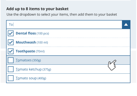
We looked around at a lot of supermarkets websites to see how they got people to pick items, and it seemed to work for food but we had stuff like childminders, car services and theatre tickets which they don’t. I took inspiration from this article on Improving the usability of multi-selecting from a long list which suggested groups and displaying every option so people can browse. We had COICOP categories for each item but they weren’t so user friendly so we created custom groups which Emily agreed to as long as we had the COICOP classifications in the data download.
I started off using items in groups as individual checkboxes and they would appear in a basket (inspired by svelte’s crossfade) and you’d get some info.
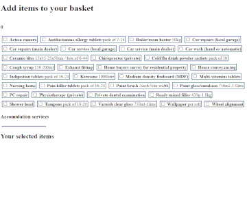
Next I added a sortable table based off one from The Pudding.
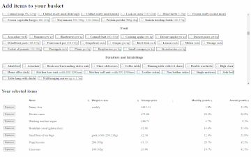
I added a search box to filter down results.
Chatting to other design colleagues, they suggested tabs for groups and accordians for sub groups. And adding a search with autocomplete field.
I shared it with colleague to test and get their feedback and it was split on how people liked to add items. Some people like search and some people liked browsing so we decided to keep both and add buttons at the top for people to switch.
Matt Weeks, a graphic designer in our team, provided some designs in figma to work from and went with the torn paper receipt styling.
We had the usual frantic bug fixing and last minute changes, and some bugs are still there but everything went fairly smoothly.
What happened after
The tool published on the wednesday and it was broken. After a quick frantic call with Ahmad, found out there’s some mime-type checking going on behind the scenes on our website which was tripping up but thankfully he had encountered this problem before and had a quick and easy to implement solution.
After the wobbly start things started to pick up. We got embedded in a few places, and the article summarising biggest movers got picked up a lot too. ONS also got invited to do a few media pieces on the tool.