Using nested data to create small multiples
08 Sep 2021In my previous post I talked about strategies to dealing with lots of data. Small multiples is a particularly powerful approach as it does give you a lot of flexibility as you can make a chart for each category you have. It’s also useful in situations like comparisons over time or comparisons against a national trend.
This post is a technical explanation about how to create small multiples using d3js. This is the approach that I use and it isn’t the only one. There are also different ways to create small multiples using different libraries (e.g. with Plot).
One big SVG or multiple SVGs?
In previous small multiple charts we made, we used to use one SVG and split it up into different parts. This made it trickier to set the external margin for the whole SVG and the internal margins for the individual charts. Now I prefer making multiple SVGs and getting them to line up with each other with CSS. I prefer it this way because it makes responsiveness slightly easier as the SVGs just flow naturally. This does have disadvantages for example annotations are harder because they have be able to fit on one small chart.
Nesting data
To be able to take advantages of d3js looping feature we need to rearrange our data to fit the format we want, specifically we need to create some hierarchy in the data.
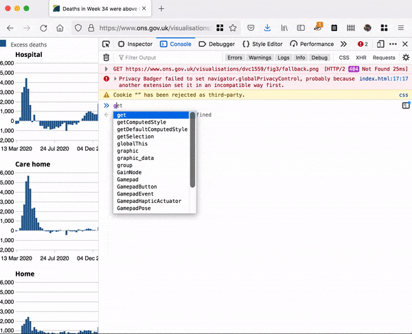
Let’s work through the example of figure 3 in the Deaths registered weekly bulletin which looks at the number of excess deaths by setting.
Number of excess deaths by place of occurrence, England and Wales, registered between 7 March 2020 and 27 August 2021
The data behind this chart would normally look something like this
| Date | Home | Hospital | Care home | Other |
|---|---|---|---|---|
| Week 11 | 145 | -303 | -60 | 30 |
| Week 12 | 286 | -270 | 6 | 53 |
| Week 13 | 427 | 341 | 264 | -22 |
Although this is table is good to read as humans and is a small file size, it’s not quite the right format for creating nested data. We need something a bit more like this
| Date | Setting | Value |
|---|---|---|
| Week 11 | Home | 145 |
| Week 11 | Hospital | -303 |
| Week 11 | Care home | -60 |
| Week 11 | Other | 30 |
This format is known as long format or tidy format, where each data point has a single row and all the attributes about that data is in a column. This format also makes it easier when there are more attributes, for example if we had this excess deaths split by sex, we would have to either add extra columns (Home Male, Home Female) or duplicate tables with either merged cells or different tabs to differentiate between the two. In the tidy data format, we just add another column for sex.
Once we have data in this tidy or long format, we can nest it with d3.nest. With our example the code would look like
nested = d3.nest()
.key(function(d){return d.Setting})
.entries(graphic_data)
where graphic_data would be the data we’ve read in from the .csv.
Once we look at nested we find it’s been transformed into an array of 4 objects, one for each setting. Inside each object, there are the properties key and values. Inside values is a subset of the rows of the table that relate to the setting.
Appending elements from nested data
Now we can use d3js to create our charts. We can use the standard .data().enter().append() pattern to first create our SVGs. Remember .data takes an array, .enter() is a selection for each new thing it needs to create that doesn’t already exist. Here we have 4 elements in the nested array, so it will create 4 SVGs.
svg = d3.select('#graphic')
.selectAll('svg.chart')
.data(nested)
.enter()
.append('svg')
The size of the SVGs is determined by the width of the page and how many charts you want on each row. I’ve omitted all the stuff to do with margins for brevity but what’s important to know is that all the charts have the same margin. The margin on the left of each chart is big enough for the ticks but also acts as a bit of breathing space between the charts.
When we want to create the bars for the chart, we can reference the data attached to each SVG. We know the data for the bars is inside the values property of each element of the nested array, so we bind that data to our rects.
chart = svg.selectAll('rect.bars')
.data(function(d){return d.values})//here d is the elements of the nested array so is attaching the array from the property values
.enter()
.append('rect')
You can now do data driven styling for your rects as each rectangle has the data bound to it.
When to call the axis generator
Here’s is the chart on mobile on the left and on desktop on the right.
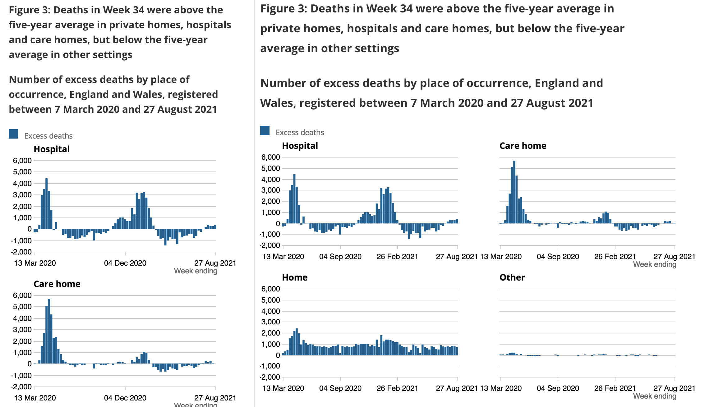
On mobile there is one chart per row and on desktop there are two charts per row. With exactly the same axis, you can easily compare the magnitude of different numbers but since the axis are exactly the same we don’t need to duplicate having axes on every chart, we just want the chart on the left side of each row to have the axis ticks. On mobile there’s only one chart in each row so you do need to have ticks on every chart.
To generate ticks only on the left axis, we can use d3’s each. This allows us to do something for each element individually. Here we are going through all the SVGs, using each to apply a function. The function looks at the index of the loop over all the selected elements and if the index divided by the number of charts per row is zero then we know it’s the left chart and we can call the axis generator with ticks, otherwise call the axis generator without ticks.
svg.append('g')
.attr('class', 'y axis')
.each(function(d, i) {
  if (i % config.chart_every[size] == 0) {
    d3.select(this)
      .call(yAxis.tickFormat(d3.format(",.0f")))
  }else{
    d3.select(this)
      .call(yAxis.tickFormat(""))
  }
})
You can also do something similar to just add the x axis label on the chart on the right.
Adapting this approach
If you’ve got categorical y-axis with long labels, it’s going to make the left margin very big would look very clumsy if you tried to repeat it for other charts. To get round this, I separated the left axis into a separate SVG and then did the nested data approach as above to create the small multiples for the final chart.
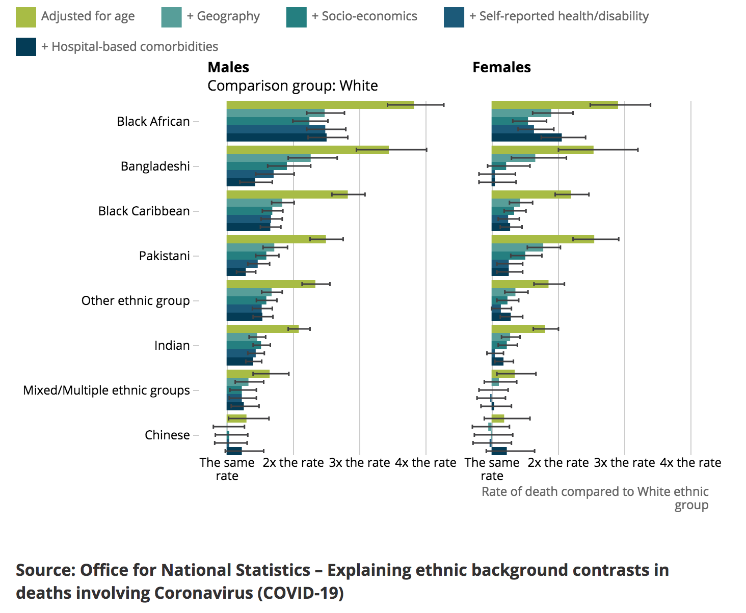
In the above chart, the data is nested on two levels, firstly by sex, and then by how the model adjusted for various factors. When binding the data you can create an svg for each sex, when a g for each model, when inside you’ll have the data for the each ethnicity.

Hopefully this helps you get your head round using nested data to create small multiple charts. For more information about binding data and creating things based on data I highly recommend Peter Cook’s guide to data joins and the enter exit update pattern.