Against all odds — how to visualise odds ratios to non-expert audiences
10 May 2020On Thursday 7 May, the ONS published analysis comparing deaths involving COVID-19 by ethnicity. There’s an excellent summary on twitter but the headline is that when taking into account age and other socio-demographic factors, such as deprivation, household composition, education, health and disability, there is higher risk for some ethnic groups of a COVID related death compared to those of white ethnicity. The full article goes into more detail including some of the caveats e.g. the strengths and weakness of using ethnicity data from the 2011 Census and not being able to use occupation.
How we presented odds ratios
What I’d like to do is talk a lot about the visuals we produced for the article.
First, what we are visualising is called an odds ratio. This definition comes from the ONS analysis.
An odds ratio is a measure of the relative risk of an outcome in one population compared with a different population, where odds ratios greater than one indicate the outcome is more likely while less than one is less likely.
It’s quite a hard concept to understand but we try out best to guide people with a number of features in the graphic.
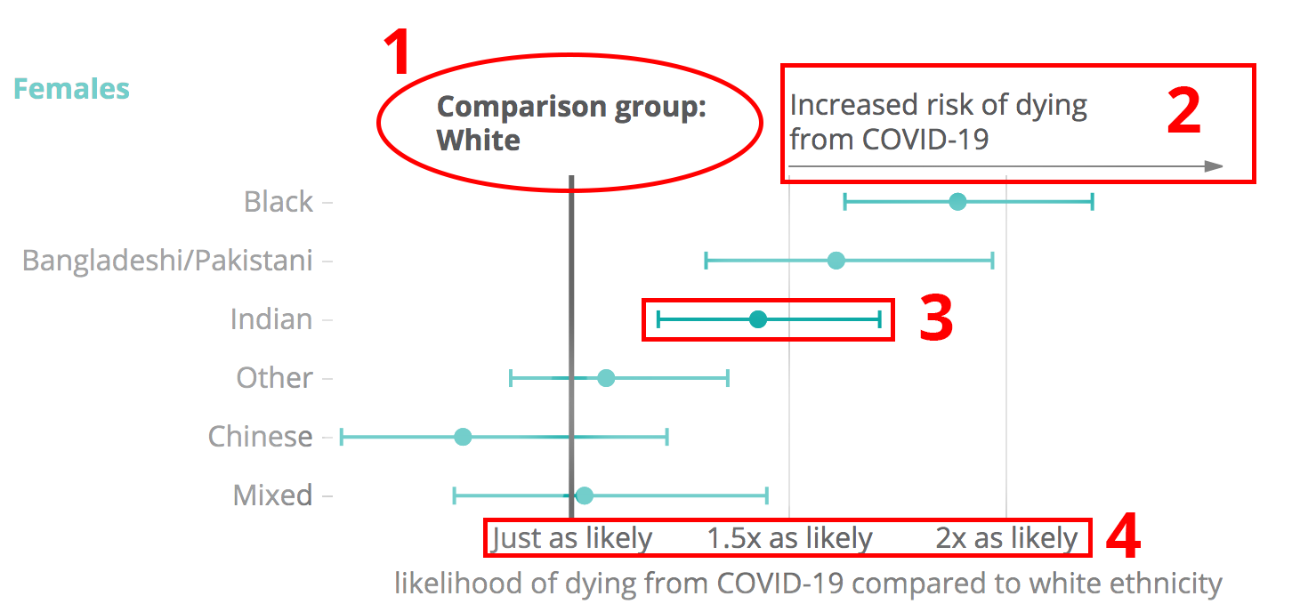
1) We make it really clear that the odds ratio refers to a comparison group. This is in bold and with a thick line
2) We tell you what it means to be one side of the line rather than leave it to the numbers and knowing that a number higher than one is more likely.
3) We’ve plotted the odds ratio as a dot because we want it’s position relative to the comparison group to be noted. We’ve also plotted the confidence intervals as lines sticking out of the dot. These are again a statistical concept and may be confusing for people but they are useful for interpreting the chart. If the confidence intervals overlap with the line for the comparison group, it means we aren’t sure that the increase or decrease in risk is really happening in the current data. It may be there but we can’t tell at the moment. To be honest, we didn’t really explain this in the notes under the chart so there’s room for improvement.
4) We’ve changed the scales to factors of likelihood. We could have plotted the raw numbers but by using phrases it makes it more understandable.
What others did
This story was covered in other publications including the Guardian, BBC, FT(£) and Daily Mail. I’ve picked these out in particular because they’ve chosen to rechart the data in their own style. The Daily Mail is an interesting example as they redid the numbers in their own style and also included a screenshot of our charts.
The BBC
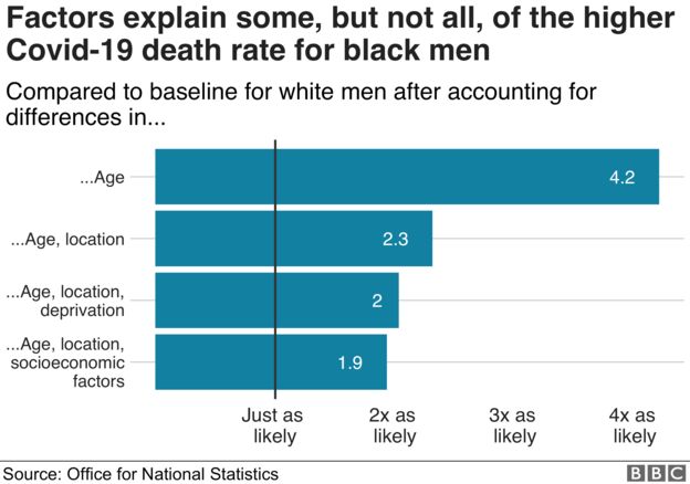
The BBC looked at the different models when we included different factors we could see how the odds ratio changed. This showed how much a factor was in reducing the risk. These charts are OK but the only thing I would pick up on was that they don’t plot the bars relative to the comparison group. It’s not stated but the bars appear to start from 0. An odds ratio of 0 means that the event is impossible.
This also causes an issue when they chart the risks for women.
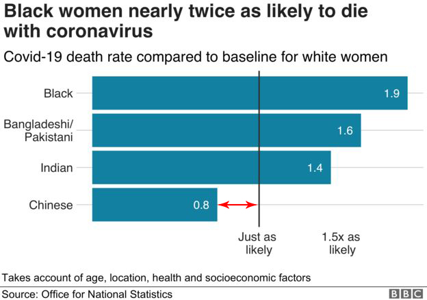
The Chinese ethnic group should actually be plotted as a bar between 0.8 and 1.
The Guardian
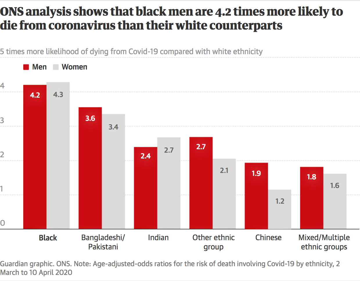
The Guardian do something similar, plotting bars from 0. They actually make a mistake when labelling the axis. They are plotting the odds ratio but label it as times more likely to die from COVID-19 compared to white. This would make the an odds ratio of 1 which is equal likelihood as the comparison group, one times more likely. You could use these axis but you’d have to take one off every value and you might struggle with odds ratios below 1.
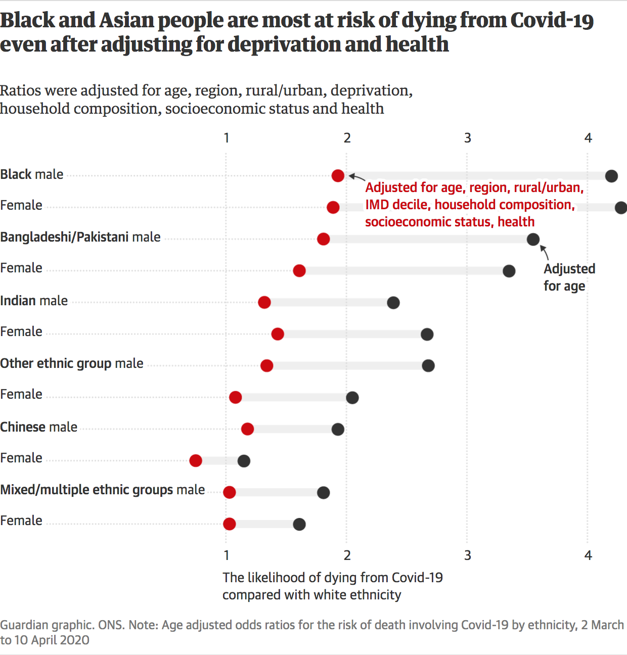
Their second chart looks to display the different models on the same chart and allow a comparison between the two. We were thinking of doing something similar but it was felt that the confidence intervals were important to show here which would make it quite messy. Without the confidence interval you can’t tell if the different between the models is significant, which in 3 of the cases is not. This means that the difference between the models might be zero. It also doesn’t show the confidence intervals with relation to 1. The axis is also unclear as it isn’t said that the likelihood of 1 is equal to the comparison.
Financial Times
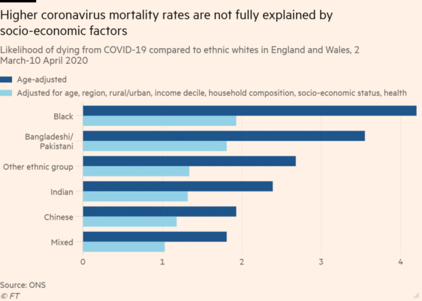
The FT also look to show the difference between the models. It’s not stated but this looks like for males. They have plotted bars from zero and use likelihood of dying without explaining that 1 is equal likelihood to comparison.
With all the bar charts, I feel plotting from zero is somewhat misleading as you might think since the bars have length at 1 this would represent an increase in likelihood but are in fact equal likelihood to the comparison group.
I don’t write to criticise the people behind the graphs as I know they are doing important jobs to get information out to a wider audience under time pressure. I also know that there is a lot of explanation that goes on around the chart either in the article or talked about with correspondents which helps explain the complicated concept of odds ratios.
I hope by explaining the thinking behind the designs of our charts and why we think they make them clearer it will help others making odds ratios charts in the future.